Product Redesign | Ringle : Booking Experience Redesign

MY ROLE
UX Research | User Interview, Insights Analysis, Persona Creation, User Journey Mapping, User Flow, Generating Solutions, User Testing, Iteration
UI Design | Wireframing, Prototyping
TOOLS
iMac / Adobe Photoshop, Xd, Figma / Zoom
Overview
Ringle is a popular online education platform in South Korea that connects students eager to learn and practice English with carefully selected tutors who have outstanding academic backgrounds. As both a user of the Ringle service and a product designer, I have always been interested in re-designing their platform.
Although I personally enjoy their English learning service, my initial experience with booking lessons was less than satisfactory. After several months of using Ringle, I decided to undertake an individual project to redesign the booking experience for students.
User Research
I conducted interviews with 3 Ringle users during a meet-up and discovered that they shared some common thoughts and experiences while using the Ringle platform. From these interviews, I gathered valuable insights and identified several issues that users might encounter when using the Ringle website or app.
Goals
Utilize Ringle to collaborate with foreign clients and improve English speaking skills.
Track personal growth and effectively use Ringle for self-improvement.
Key Insights
Customarily watch on the upper right navigation bar to search for ‘my lesson’
Lower-right lesson section is unobserved at all
‘Lessons in 24 hours’ coming upper than booking button doesn’t make sense to me
Feel confused about what to click when I want to book lessons
Hope my lesson page is being shown on the main page
My priority is booking lessons
Want to see all the booked lesson schedule at a look
Always select the tutor first, so I do not need to see the time slots for the entire 24 hours
Have no idea about featured tutors
Time selecting is confusing because its interface is showing 24-hour slots
Booking resets automatically when I go back to the previous step
Always feel annoyed especially when I am booking multiple lessons because it requires every single clicking for each lesson
Want to use tablet PC when having a lesson, but it’s inconvenient because only mobile version is being offered
Tried the mobile app once when I had no laptop near me, but it was not user-friendly (inconvenient)
Failed to share my tutor with another user and the search function didn’t work well
Point, coupon, and credits information is not indicated so I lost $100 points without my knowledge
Pain PointS
No eye-candy content - no idea what to click
Location of booking buttons
Unfriendly interface - including mobile version
Time selection - 24-hour slots
Automatic resetting
No responsive design for tools
Need of ‘My lesson’ showing on main screen
Missing information
Advanced filter function for tutors - no idea about featured tutors
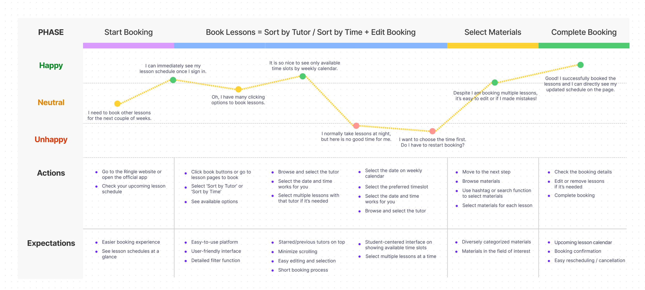
User Journey
User Persona

Journey Map
Design Solution
—
Create a Responsive Interface:
Develop a new interface compatible with both tablet PCs and desktops.Display Key Information on the Main Page:
Show the next upcoming lesson and provide a lesson calendar prominently on the main page for easy access.Streamline Layout:
Remove the lesson section from the lower left.
Relocate the top navigation bar to the left side.
Enhance Account Information Visibility:
Display the user's account details on the right side, clearly indicating the number of credits, points, and coupons.Revamp the Booking Page:
Redesign the entire booking page to create a user-friendly interface.Eliminate the 24-hour time slots and display only available lesson times when sorted by tutor.
Indicate the exact number of available slots on the time buttons.
Add divided preferred time slots with buttons for easy selection.
Minimize scrolling and reduce confusion when selecting lesson times.
Show a lesson summary where users can check all details on one screen.
Unify the Interface Design:
Use a coherent UI throughout to minimize visual clutter on the booking page.
Visual Design
Wireframes


User Flow

Prototypes


Usability Testing
I conducted a quick and simple user test online due to the current difficulty of meeting in person. Utilizing Zoom, I shared the prototype link and observed how the user interacted with and reacted to the new design. This allowed me to gather valuable and relevant feedback from the actual users who understand the inconveniences and needs associated with the existing design.
User Task
Task 1.
1. Book lessons with the tutor ‘Alice’ at 8PM, January 16, and at 9:30PM, January 21.
2. Click the hashtag ‘Work & Life’ and select the ‘One year of trash in a mason jar’ for the lesson on January 16.
3. Select the ‘A blank canvas was sold for $15M’ for the lesson on January 21.
4. Check your booking details and complete booking.
Task 2.
1. Start booking through the lesson calendar.
2. Book 2 lessons in total. — At 0:30AM, January 21 and 1:00AM, January 22. The tutor is all ‘Alice’ for each.
3. Remove the lesson on January 21.
4. Click the hashtag ‘Study Tips’ and select ‘Effective tips to help you speak English fluently’.
5. Change ‘Restore my lesson credits’ to ‘Show availability of this tutor’ and complete booking.
Feedback
New interface is a lot beautiful and intuitive! Hope it fits well for my iPad too.
I LOVE the idea of lesson calendar!
Showing the upcoming lessons is good. But I would like to see my lesson stat as soon as I sign in.
It would make me want to be passionate about studying. Hope there will be something.
Is it a too much marketing perspective?I do not need all the detailed information of lessons for now here on the home screen.
I bet the 'upcoming lesson' on the main page can be visually more emphasized.
I like having multiple options to book lessons.
As I instinctively see the date first, I hope there is a mark on today’s date.
It’s easy to find available lesson time as the 24-hour slots were gone.
I instinctively click the date instead of the preferred lesson time when I book lessons ‘sort by time’.
The ‘preferred lesson time’ buttons can be shown in the middle so I can directly select one.
I like the booking summary, but lesson time better be more emphasized than the tutor name.
Should I click the next lesson once I select the material?
As I booked multiple lessons, I didn’t notice if the lesson material is selected correctly for each one.
Maybe can change the button design.On the lesson material page, hashtag categories are not visible.
I wouldn’t know they were there if I didn’t have this task.
Iteration


Next Steps
Redesign the mobile app based on the research results of current booking experience
Apply the actionable insights from the user such as ‘tutor sharing’, ‘showing lesson stats’, and ‘encouraging learning’ on the website