Product Design | EZ-ER : Design Thinking for Emergency Room Waiting Experience
Jenna Park, Sara Cheng, Chih-ling Kuo, Ashby Poonoly
Project Length : 4 Week
Macbook Pro Retina / Adobe Xd, Photoshop, Illustrator, Sketch

Project Overview
Traditionally, healthcare is one industry that has been very slow to change – they still rely on paper documents, faxing documents which can lead to mix-ups medical errors. Patient safety is still a concern with cases where a surgeon has operated on the wrong area of a patient. Our team was tasked with identifying new ways for helping patients feel comfortable and safe during those potentially long waiting periods with using design thinking framework. Within the last 5 years, design thinking has become more and more prevalent among top organizations to help them re-imagine problems from the end user’s perspective and to help them innovate.
To resolve the given statement of the slow change and long waiting hours, our team decided to reimagine the waiting experience in the Emergency Room of Ontario, Canada. We came up with an app of calculating the wait time of Emergency Rooms to minimize the unnecessary waits and deliver a small convenience to users.
Problem Space
When a patient comes to the emergency room at the hospital, their care is prioritized based on the severity of the patient’s condition and the other patients who are already in the waiting room. As a result, wait times for a given patient are difficult to predict. Patients and their families may spend hours waiting to be seen and/or treated by a doctor or another health care professional.
Empathize Phase

Before we start the project, our team visited the nearest Emergency Room from Humber College to begin the research of the Emergency Room waiting experience. We observed the place and tried to connect what we felt and the results of the user interviews from people who have the waiting experience in the Emergency Room.
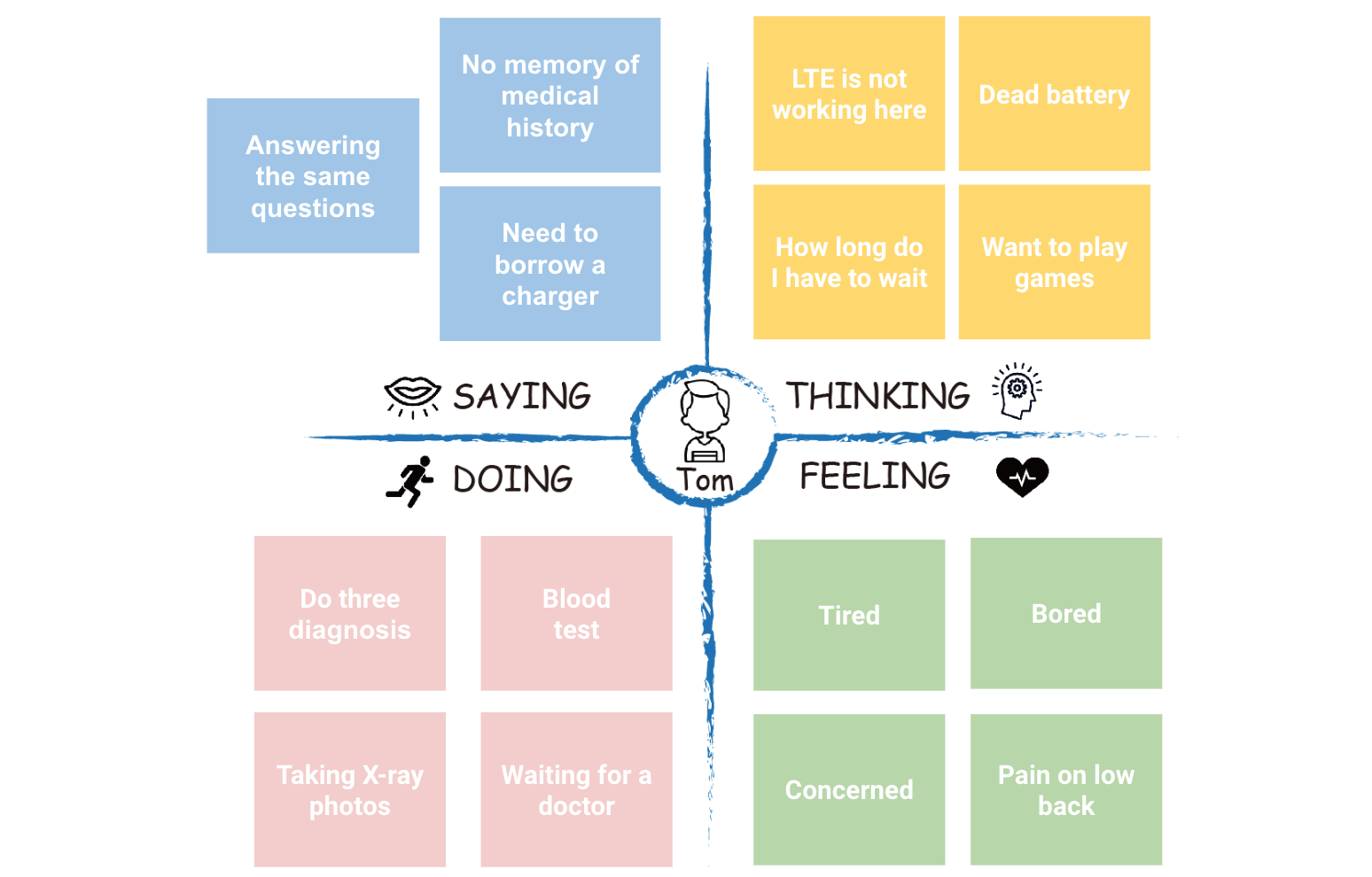
Empathy Map
We interviewed two people who have former waiting experience in the Emergency Room. Both of the interviewees do not know each other, but their responses were pretty similar. They said they felt had tired and bored and had to repeat the same questions and answers again and again. And never-ending waiting times were continued to them. Our team created the empathy maps based on the interview results.

Define Phase
Scenario
During a workout session at home, Abby felt a sharp pain in her abdomen. Fearing she may have seriously injured herself, Abby took the bus down to her walk in clinic where she was informed that she should go to the emergency room for more urgent care. Abby takes another bus to the nearest hospital and is now in the emergency waiting room.
Among her in the waiting room are other patients who are also waiting to be seen and treated by a doctor or healthcare practitioner. Abby is alone and not sure how long the wait will be to see a doctor. It’s been 3 hours since she came in and she has not received any updates or had a hospital staff member come speak with her. Abby is prone to anxiety and is becoming more and more anxious with each passing hour without knowing what is happening regarding her situation.
Proto-Persona

As-Is Scenario Map

There are several discovered issues.
Didn’t know whether she should go to the ER directly
Was worried about severity of injury
Patient has to take transportation twice at least to complete diagnosis
Patient has to duplicate the information provided during the injury process
Process of diagnosis is long-winded and inconvenient
Persona
In order to better understand the ER users, our team created user personas based on the proto-persona and the as-is scenario map. These two were created to reach and fulfill the user needs and goals.


Identify Problems
In Ontario, the average ER wait time is 5 hours.
There is not much you can do while waiting
No update of wait time
No entertainment sources and distractions can help time pass time
The seats are uncomfortable, rigid, and limited.
Patients become bored, frustrated, and impatient
Waiting, without knowing how long to wait
With a national wait time average of 4.4 hours for emergency departments, there's clearly plenty of room for improvement.
Research Questions
How does a triage nurse categorize injuries (low, med, high?)
What fact finding questions do triage nurses ask?
What are average wait times for hospitals?
How busy do Emergency Rooms get?
Ideate Phase
Ideas for Improvement / Big Idea Vignettes
After we got an understanding of what our users’ problems and challenges were, we decided to use the Big Idea Vignettes to rapidly brainstorm possible ideas to solve our users’ challenges. Afterward, we examined each other’s ideas and then decided which idea stood out, and we wanted to explore further.
Purpose of the Ideas
Reduce amount of Triage time
Diagnose user injuries faster
Give the user a sense of getting things done
Reduce anxiety levels of patients
Keep user injury details on record
Reduced patient discomfort while waiting
Improved emergency room image
Inform users of nearest ER

Prioritization Grid
At this point, we had a lot of ideas floating around, and we could not pinpoint which idea would add value, and which didn’t. So, we decided to use the prioritization grid to help us evaluate, and prioritize our ideas by focusing our discussions on their importance and feasibility.
Solution
Our idea is to create an app that contains an online form to fill before / while traveling to an Emergency Room. This form will be sent to the Emergency Room that the user decides to visit and will include users: health card number, photos of injury, medical history, etc. The Emergency Room can use this form to process the patient quicker. The app will also house the users medical details.
Features
Help users to reduce their time spent waiting
Distribute patients evenly across nearby hospitals
Tackle the issue of overcrowded emergency rooms
Get users through emergency rooms faster
Help patients to understand and prioritize their medical issues.
Shorten the process to register as a patient
Make users choose appropriate medical centers according to their situation
Help users to consolidate their medical information
Target User
All users who have smart devices that can use the app
Users who are willing to use the app
Frequent emergency room visitors
Language Barriers between patients and health practitioners
Seniors who have troubles remembering lots of information
Students ( Domestic / International )
Reiterate
After we conducted our initial user tests with our paper prototypes (drafted from our sketches), we decided that we needed to reiterate our app. For the reiteration phase, we decided that we wanted to:
Interview a triage nurse
Conduct additional user tests
Interview with a Triage Nurse
Goal
Learn about the triage process (length, who does the intake, how long does it take?)
How are medical records accessed
Why do ERs get busy?
What would a nurse do to improve the process
What can we eliminate from the process
What we learned
Triage nurses are mandatory, triage nurses verify and authenticate injuries
Triage process does not take too long, about 10 mins per patient
Triage nurses are the ones who categorize injuries behind the scenes
Hard to store medical files online/cloud due to privacy issues
Triage is busy only when there are a lot of visitors
Most of the waiting is done in the waiting rooms or in between tests and scans
Re-Imagining our Ideas
Our initial idea of an online form would slow down the triage process
Our app required too much user text and visual input that would be difficult to utilize with algorithms
Online form is made redundant by triage nurse’s work
Storing medical records in a cloud is risky (possibility of hacking)
Shift focus from speeding up the process to reducing the number of visitors to emergency rooms
The second version of EZ-ER is an injury priority calculator.
Our app is for anyone who needs to visit an Emergency Room with non-life-threatening injuries.
Revised Purpose of Our Ideas
Assist in screening for people who believe they are more injured than they actually are
Weed out the overthinkers
Let users know how long they can expect to wait to get their injury processed
Reduce anxiety levels of patients
Provide users with a better understanding of their injury

Prototype Phase
First Wireframe
After we got a good idea of what features, and elements to include in the product, we started wireframing our design. As we wireframed, we thought about sequence and state:
How will a user get here and where do they go from here?
Will this step have multiple states depending on which path the user takes to get there?
So we conducted the user testings with the first wireframe.

Test Phase
User Testing
Our team conducted the user testings and discovered some issues below:

Login should not be required to use apps injury calculator (main purpose), login is only used to maintain privacy of medical profile
Emergency mode becomes redundant
No option to add previous medical diseases/illnesses
There was no option to specify if the injury sustained was external or internal
So we started re-designing our wireframe with the result of user testings.
Updated Wireframe

Prototype
I created the high fidelity prototype after finished the project. The prototype was simply designed including the logo, icons, and user interface. I got inspired by the first aid kit in completing the design.


Feel free to browse how the prototype works!

Retrospectives
What worked well?
Big idea vignettes
Feel pain area
Revised wireframes
What didn’t go well?
Unnecessary emergency mode
Improper concept for the real Emergency Room system
Wireframe flow made users confused
What we might try next?
Conduct more usability tests
Understand the system before start creating ideas
Next Steps
Conduct more interviews to gain additional perspectives and opinions on emergency waiting room experiences.
Conduct further user testing to discover or optimize apps affordance.
For more precise priority categorizations, we could visit more Emergency Rooms in different cities and learn how those triage nurses categorize patients.
Roll
I participated in the entire design thinking process, identifying problems, translating it into ideas for improvement, creating personas and wireframes. I did 3 user tests for the first wireframes and analyzed it to recreate the wireframes and design prototypes. The project was finished with wireframing, and I personally created the high fidelity prototypes based on the process after our team completing the project.